Client
Blue Room Production
Services
Audit
Web Design
Web Development
Blue Room Production
With 16 years behind them and steady organic growth, Blue Room stands on solid ground. They know who they are and where they’re going.
But their website had fallen behind that reality. We helped them take a step back and translate a strong business into a new website.

The Decision
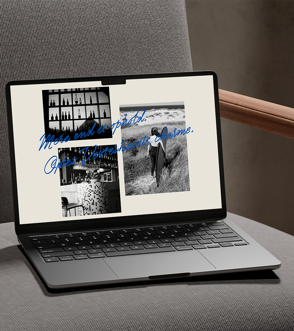
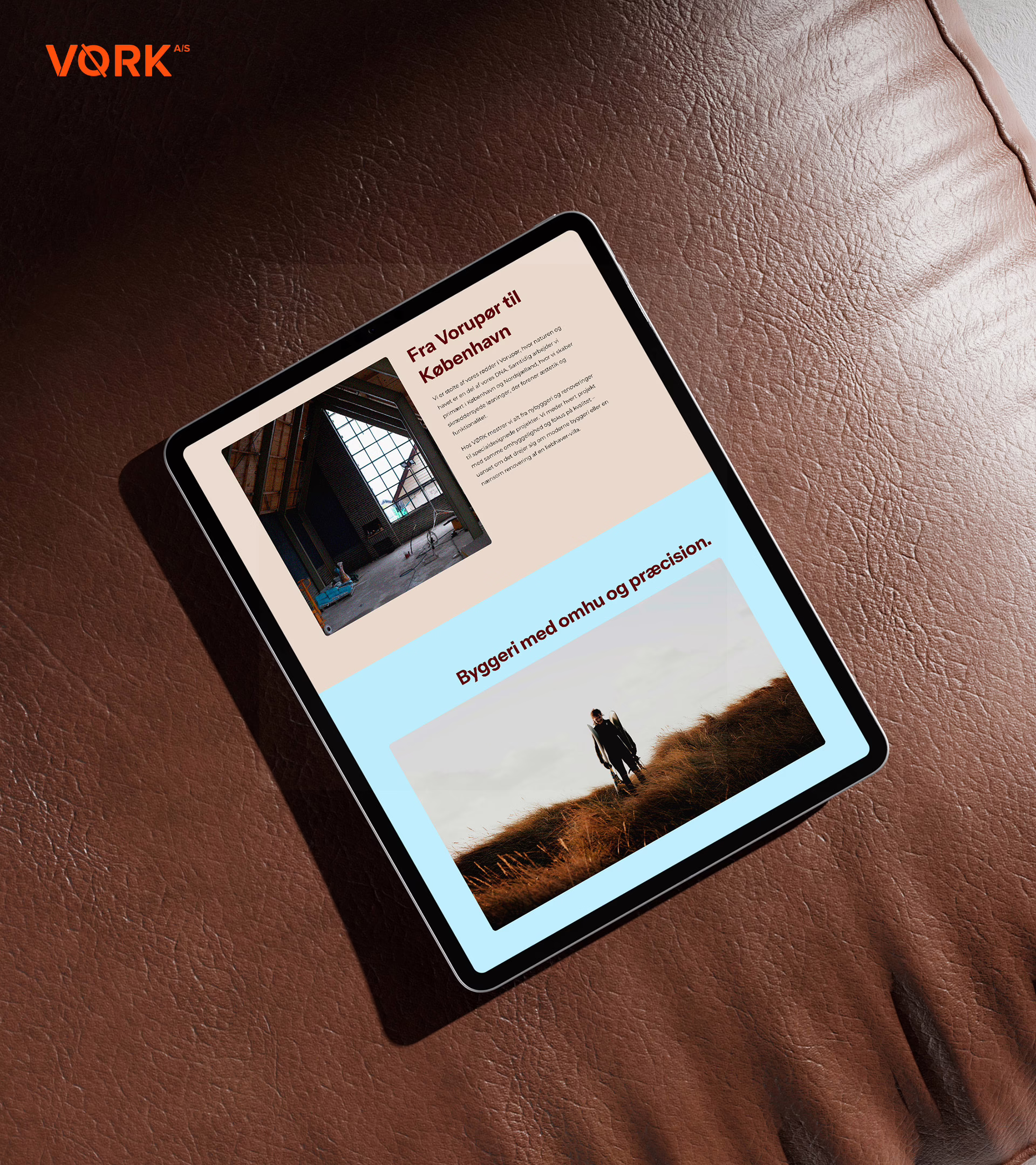
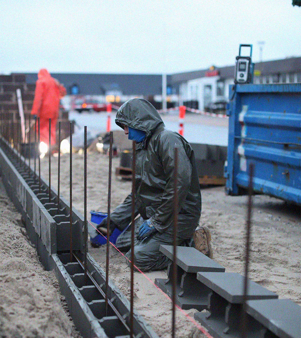
Go back to the roots and bring the behind-the-scenes stories back through the blog, giving clients a clearer window into how the work is made.
What Changed
The website moved from a passive showcase to an active space for storytelling.
Clients and potential clients can step into the process, not just see the final output.
The Concept
A blog can feel old school.
But when storytelling is in the DNA, it becomes a natural part of the work.

Soft Exposure
#F4F5F9
Raw Black
#1F1F1F
Stamped Orange
#F67012